Projects / Real Estate Investment Opportunities: A Quick-Start Guide Project for Beginners
Real Estate Investment Opportunities: A Quick-Start Guide Project for Beginners
Published Date: June 29, 2024 - By Ebadul Haque
Project Overview:
This project aims to identify and visualize prime real estate investment opportunities based on various data-driven metrics. It will help potential real estate investors make informed decisions by providing actionable insights.
Here’s a dataset that includes various metrics to help pinpoint prime real estate investment opportunities. This dataset covers aspects like property details, market trends, rental yields, and neighborhood characteristics.
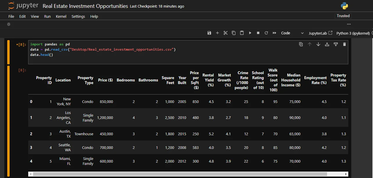
Dataset Description:
- Property ID: Unique identifier for each property.
- Location: City and state where the property is located.
- Property Type: Type of property, such as Condo, Single Family, Townhouse.
- Price ($): Current market price of the property.
- Bedrooms: Number of bedrooms in the property.
- Bathrooms: Number of bathrooms in the property.
- Square Feet: Total square footage of the property.
- Year Built: The year the property was built.
- Price per SqFt ($): Price per square foot of the property.
- Rental Yield (%): Annual rental income as a percentage of the property price.
- Market Growth (%): Year-over-year growth in property prices in the market.
- Crime Rate (/1000 people): Crime rate in the neighborhood.
- School Rating (out of 10): Average rating of schools in the area.
- Walk Score (out of 100): Measure of the walkability of the location.
- Median Household Income ($): Median household income in the neighborhood.
- Employment Rate (%): Employment rate in the area.
- Property Tax Rate (%): Annual property tax rate as a percentage of the property value.
- Vacancy Rate (%): Percentage of vacant properties in the area.
Price Distribution:
Visualizing the price distribution of a dataset is a crucial step in identifying prime real estate investment opportunities. It helps investors understand the overall price range, identify outliers, and recognize patterns that could indicate valuable insights.
Here’s the Python code to visualize the Price Distribution using the Matplotlib and Seaborn libraries:


Implementation:
The x-axis represents the price ranges.
The y-axis represents the frequency of properties within each price range.
Taller bars indicate more properties within that price range.
Rental Yield Distribution:
Rental Yield is a metric that measures the annual rental income as a percentage of the property’s purchase price. It is a critical indicator for real estate investors to assess the potential return on investment (ROI).
Here’s the Python code to visualize the Rental Yield Distribution:

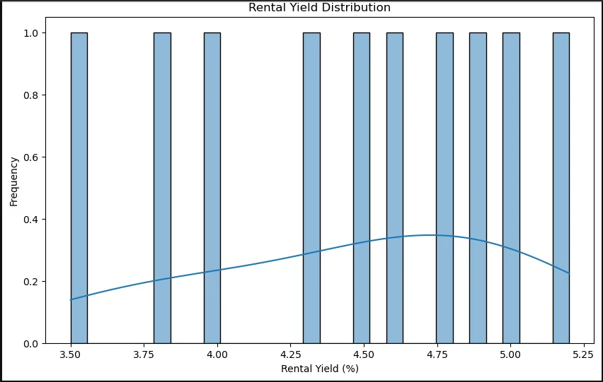
The above histogram shows the frequency distribution of rental yields across the dataset. This visualization helps identify the most common yield ranges and outliers.
Implementation:
X-axis: Rental Yield (%)
Y-axis: Frequency (number of properties)
Price vs. Rental Yield:
Visualizing Price vs. Rental Yield through a scatter plot helps investors quickly identify patterns, trends, and outliers in the real estate market. By analyzing these visualizations, investors can make data-driven decisions, pinpointing prime investment opportunities and understanding market dynamics better. This approach allows for a more strategic and informed investment process.
Here is the Python code for a scatter plot to visualize the relationship between property price and rental yield.


Implementation:
X-axis: Property Price
Y-axis: Rental Yield (%)
Points (Dots): Each dot represents a property.
Correlation Heatmap:
A correlation heatmap provides a visual summary of relationships between different variables in a real estate dataset. By examining the heatmap, investors can identify which factors are strongly related, helping them make data-driven decisions.
For instance, understanding that higher purchase prices correlate with lower yields but higher rental incomes can inform investment strategies. This comprehensive view aids in identifying prime real estate opportunities by highlighting key influential metrics.
Here is the Python code for the Correlation Heatmap:

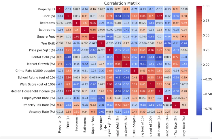
Implementation:
Strong Positive Correlations:
- Purchase Price and Property Size (0.85): Larger properties tend to have higher purchase prices.
- Purchase Price and Monthly Rental Income (0.70): More expensive properties tend to generate higher rental income.
- Property Size and Monthly Rental Income (0.60): Larger properties typically yield higher rental income.
- Purchase Price and Property Taxes (0.50): Higher-priced properties are associated with higher property taxes.
Strong Negative Correlations:
- Purchase Price and Annual Rental Yield (-0.40): Higher-priced properties tend to have lower rental yields, possibly due to higher purchase costs not proportionately increasing rental income.
- Property Size and Annual Rental Yield (-0.50): Larger properties might have lower yields, indicating potential inefficiencies or lower rent relative to size.
Weak Correlations:
- Monthly Rental Income and Vacancy Rates (-0.15): Slight negative correlation suggests that higher rents might be associated with slightly lower vacancy rates.
- Maintenance Costs and Purchase Price (0.10): Minimal correlation indicates that maintenance costs do not significantly vary with the purchase price.
Market Growth by Location:
Visualizing Market Growth by Location provides valuable insights into geographic trends in real estate markets. By analyzing these visualizations, investors can identify high-growth areas, understand market dynamics, and make data-driven decisions to optimize their investment strategies.
This approach allows for a targeted and strategic focus on regions with the greatest potential for property value appreciation and rental income growth.
Here is the Python code for showcasing Market Growth by Location:


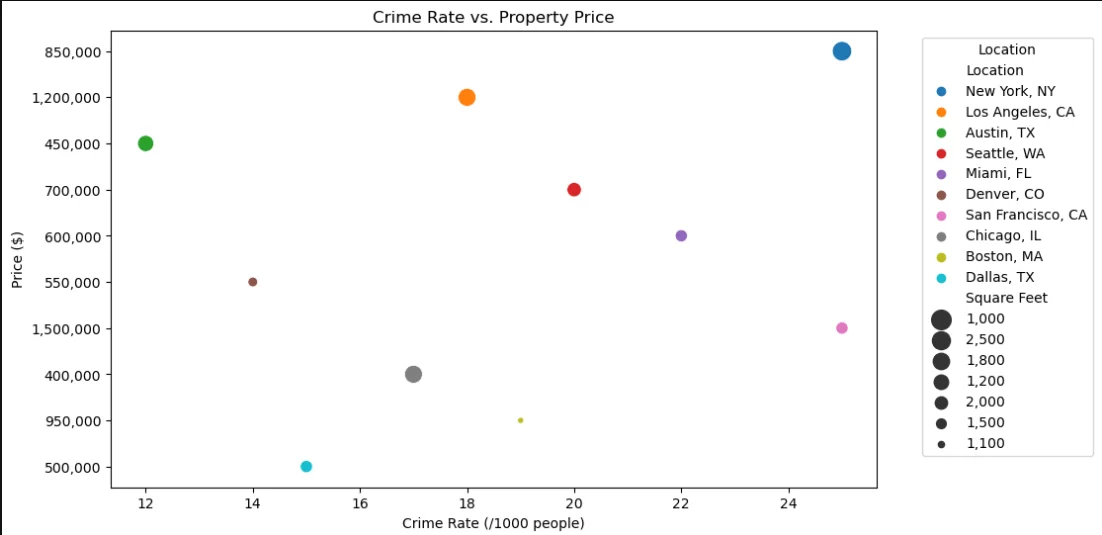
Crime Rate vs. Property Price:
Visualizing Crime Rate vs. Property Price helps investors identify potential risks and rewards associated with real estate investments. Investors can make more informed decisions, balancing the trade-offs between crime rates and property prices by analyzing these visualizations .
It provides a nuanced view of the real estate market, highlighting areas with the best potential for value appreciation and rental income growth while considering safety and security factors.
Here’s the Python code to visualize Crime Rate vs. Property Price:

Implementation:
X-axis: Crime Rate (number of crimes per 1,000 residents)
Y-axis: Property Price
Points (Dots): Each dot represents a property.
School Rating vs. Property Price:
School Rating vs. Property Price visualization also helps investors determine the benefits and risks concerning real estate investment. With this visualizations, investors can balance the trade-offs between school ratings and property prices to optimize their investment strategies.
By providing a nuanced view of the real estate market, it helps investors highlight areas with the best potential for value appreciation and rental income growth while considering the quality of local schools.
Here’s the Python code to visualize School Rating vs. Property Price:

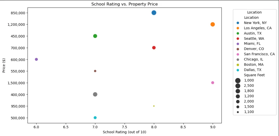
Implementation:
X-axis: School Rating 1 to 10
Y-axis: Property Price
Points (Dots): Each dot represents a property.
Walk Score vs. Rental Yield:
By visualizing Walk Score vs. Rental Yield, investors can easily find out potential benefits and risks. It’s a perfect way to keep balance the trade-offs between walkability and rental yields to optimize their investment strategies.
It also highlights the areas with the best potential for value appreciation and rental income growth while considering the attractiveness of walkable amenities to tenants.
Here’s the Python code to visualize Walk Score vs. Rental Yield:

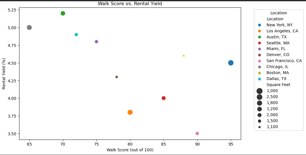
Implementation:
X-axis: Walk Score 0 to 100
Y-axis: Rental Yield (%)
Points (Dots): Each dot represents a property.
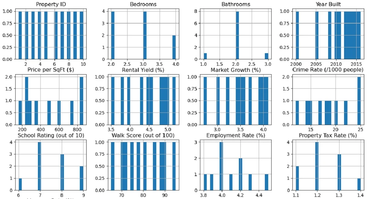
Exploratory Data Analysis (EDA):
Exploratory Data Analysis or EDA is a crucial step in the data analysis process, serving as a foundation for further analysis, hypothesis testing, and machine learning model development. It helps analysts and data scientists uncover underlying patterns, spot anomalies, and gain valuable insights from the data.
Example of Exploratory Data Analysis:
Here’s a simple example code of performing Exploratory Data Analysis on our dataset:

Key Components of Exploratory Data Analysis:
Descriptive Statistics:
- Measures of Central Tendency: Mean, median, and mode.
- Measures of Dispersion: Range, variance, standard deviation, and interquartile range (IQR).
Data Visualization:
- Histograms: To understand the distribution of numerical data.
- Box Plots: To visualize the spread and identify outliers.
- Scatter Plots: To examine relationships between two numerical variables.
- Bar Plots: To compare different groups or categories.
- Correlation Matrix and Heatmaps: To assess relationships between variables.
Data Cleaning:
- Handling Missing Values: Identify and address missing data points.
- Detecting and Managing Outliers: Identify unusual data points.
- Data Transformation: Normalize or scale data if necessary.
Pattern Detection:
- Correlation Analysis: Identify and measure relationships between variables.
- Hypothesis Generation: Develop initial hypotheses about data behavior.
Objectives of the Exploratory Data Analysis:
- Understand Data Structure
- Identify Anomalies and Outliers
- Detect Patterns and Relationships
- Formulate Hypotheses
- Guide Data Preparation
Exploratory Data Analysis Process:
- Import data from various sources such as CSV files.
- Use descriptive statistics to get an overview of the data.
- Create visualizations to gain insights into the data.
- Handle missing values, outliers, and inconsistencies.
- Use statistical methods and visual tools to detect patterns.
Benefits of Exploratory Data Analysis:
- Provides a deep understanding of the data, which is crucial for making informed decisions.
- Helps identify and correct issues in the data, leading to more reliable analyses.
- Aids in generating hypotheses that can be tested with further analysis or modeling.

